
Australian Ballet Brochure Brief
This brochure design was apart of a University assessment where the brief was to create supporting collateral for the Ballet Production of Cinderella that was presenting soon. The Australian Ballet asked to reduce their printing costs by limiting the design to 2 printing colours while creating a high quality aesthetically pleasing solution to this event. We were supplied the required text, logos, and 2 images and we to undergo research to provide further imagery to support our designs. An overall goal to deliver good design principals and be able to clearly state the most appropriate paper choice for print.

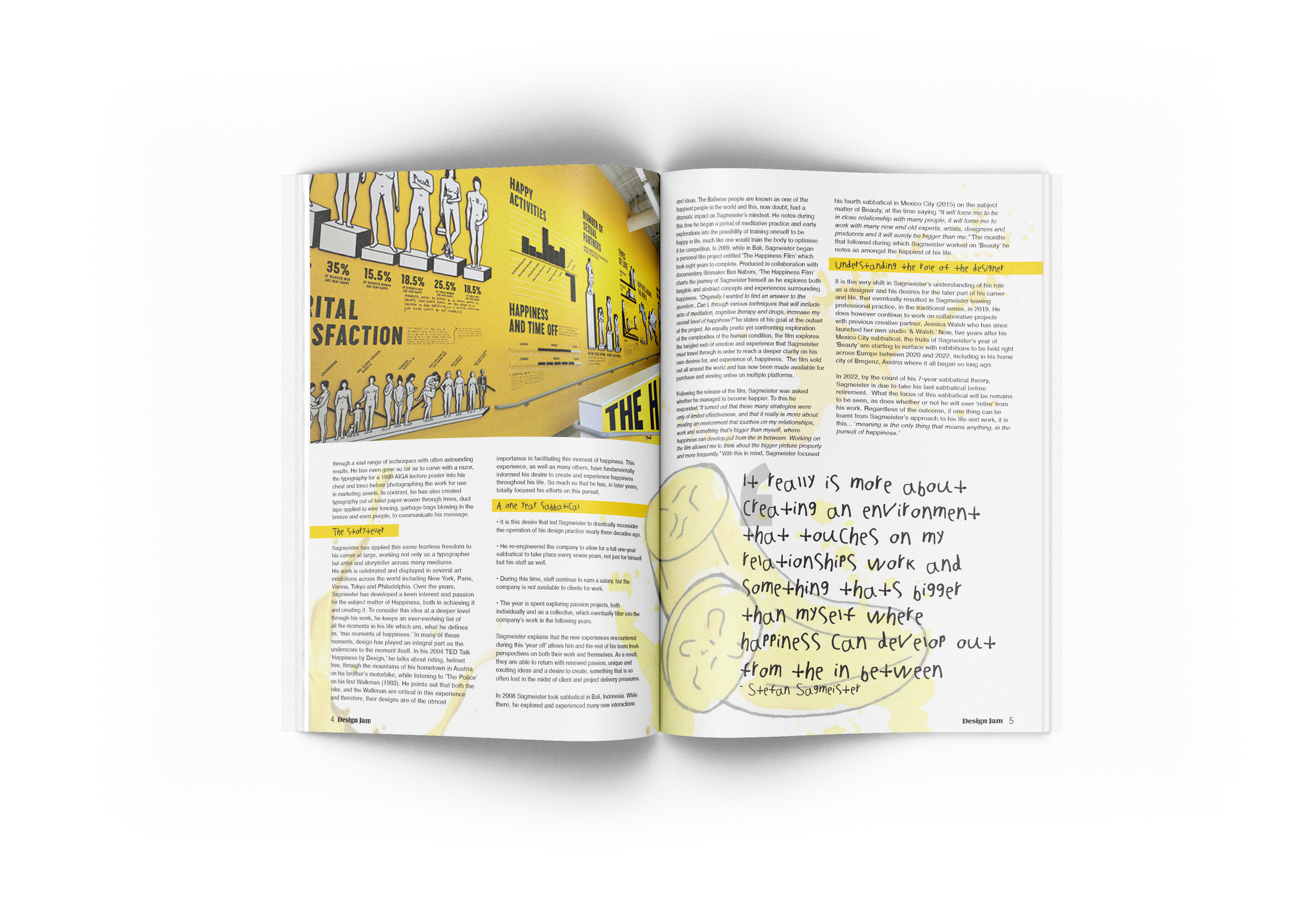
Stefan Sagmeister
For this assessment brief we were supplied 3 articles on different artist and we were select 1 to develop. I chose Stefan Sagmeister as my subject as I felt the design outcome would be a fun process, and it was. We created 2 page magazine spread with the supplied text, titles, subtitles, and suggested quotes and we were to either create and or source supporting images. The biggest influence on the direction of the design was the ability to capture the designers style, feel and tone through the magazine layout.


Maxim Organics
For this assignment we were provided a variety of product images a long with models and a style sheet. For the products we deep etched them and selected 3 that will be used in an advertisement design for Maxim. We demonstrated that we can retouch the model photos and edit them as desired that will also be used the advertisement. With the style sheet we had natural plant graphic elements that we could use to enhance the design along with the required font and colour pallet. We were being marked on the quality of deep etching, model retouching and how we utilised the style guide to create an effect advertisement piece.

Hong Kong - Table by Table
This was my first assignment to put together a magazine layout. We were provided the text for the article on ‘Hong Kong - Table by Table’ which is about the amazing street food in China. Along side that we had access to a range of images to use through out the layouts. This was a multi spread design so we had a lot of room to use images. At this point in time I did not know much on how to lay a document out so I just started with using an image I love and made it the hero which it fits perfectly on the left capturing the woman and her dog facing the text which doubles as a lead to follow. This assignment is what made me start loving learning how to create layouts and has maintained being my favourite task to complete. We were being assessed on how we set up the body copy, headings, subheadings, aligning it and of course the overall visual outcome to top it off. For my first layout design I am very proud of how it turned out.


Southpower Brand Refresh
This brief was to select a local business from where we are from and give the logo and branding a refresh. I chose to do Southpower Electrical Services Pty Ltd which is a Level 1 and Level 2 company. On the left is the original logo and business card, for this refresh I created a modern take with a new font and minimalist illustration of a powerline connection to a house. This logo hypothetically would be printed across business cards, letter heads, uniforms, trucks, and cars which is why I did not think the logo should be overly complicated for scalability across such different surfaces. The logo is efficient which is direct reflection of how this company runs.


Sukin Brand Refresh
We were presented a variety of well known brands to recreate their logo, as you can see here I chose Sukin. Sukin is natural beauty care production line that launched in 2007 which has only had a few minor changes over the years to their branding. I kept the core elements of the brand as you still want their customers to recognise them throughout the stores, however gave it a modern look and feel by rearranging the leaf’s location and texture complimented with a new font. Between the leaf, colours and font choice it maintains the natural feel aligning with their original branding with a fresh ‘clean’ aesthetic approach.